Stepping into the art of

STUDIO
GHIBLI

Get to know me

Hello, I’m Jolene and I am a year 2 student studying at Temasek Polytechnic, currently pursuing a diploma in Interior, Architecture and Design. Since I was young I have really loved Studio Ghibli films, My Neighbour Totoro being my favourite film of all time. To be really honest I did not start liking My Neighbour Totoro because of the storyline or the style, I generally liked it because of the character Totoro. I dreamed of meeting Totoro until I realised it was not real. Growing up, I slowly got exposed to more Ghibli films like Spirited Away, Castle in the Sky and Princess Mononoke. Besides My Neighbour Totoro, my two other top films by Studio Ghibli are Howl's Moving Castle and Whisper of the Heart because I am a huge fan of the romance genre, and both films do contain a slight romance element.Something that I am still in awe of about Studio Ghibli up to this day is their art style. Although some might say most Japanese animations have somewhat of a similar art style, Studio Ghibli just feels different. To me, Studio Ghibli gives me more of a late 90s feel in terms of their style even their storylines from the different films revolve around the 19 hundreds.With this, I decided to use Guided Learning as an excuse to get myself to research and study more about the art styles of my top favourite Ghibli films, and also try putting my painting skills to the test and try recreating scenes that I think would be from a Ghibli movie.The subject guided learning allows me to explore my chosen area of inquiry through self-directed learning. The process focuses on four stages: planning, performing, monitoring and reflecting. I get to plan m own individual learning project, refine and execute the learning plan, as well as monitor and reflect on their learning progress and project. The learning will then be captured and showcased through a portfolio, like what you are seeing now. Self-directed learning project aims to broaden and deepen a student’s knowledge and skills.Through this subject, I aim to be more self-directed,competent and a better problem solver. Hoping to learn how to face challenges on my
own and find ways to solve problems on my own. With that, I can become more competent as I will develop more knowledge and problem-solving skills which will allow me to react to any challenges, now and in the future.

About Studio Ghibli

Studio Ghibli is a Japanese animation studio founded in 1985 by the directors Hayao Miyazaki, Isao Takahata, and producer Toshio Suzuki. It is best now for animated films like My Neighbour Totoro(1988), Princess Mononoke(1997), ( Spirited Away(2001), Howl’s Moving Castle (2004), and many more.


Film Analysis

film 2:

click any film title to proceed


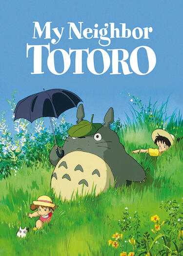
Film 1:My Neighbour Totoro
directed by Hayao Miyazaki
produced in 1988


Synopsis

My Neighbour Totoro is about two young girls, Satsuki who is 10 years old and her younger sister Mei who is 4 years old. They moved into a house in the country with their father to be closer to their hospitalized mother. Satsuki and Mei discover that the local forest is inhabited by wondrous woods spirits called Totoros. They soon befriend some who live nearby their house


Scene 1: 0.04.35

Miyazaki once mentioned that children are what keep him going. Not a specific child, but children in general. He believes that children have yet to let their childhood get violated by adult common sense, thus he chooses not to underestimate the intelligence of children or their powers of understanding. He believes that children remember everything they see, when something is gone they notice. With that factor in mind, he always adds some sort of minor elements/unnoticeable details into his scenes.This scene in My Neighbour Totoro is one example - you can see that there is a bottle at the bottom of the stream that could have been thrown in by someone. I’m sure while watching the film most would have probably not noticed such a small detail and what more the little insects that were crawling over the bottle. When drawing such a scene with so much nature, Miyazaki always aims to draw it as realistic as possible, with emphasis on every single tiny detail.

Scene 2: 0.31.00

The reason why Miyazaki always aims to make scenes as realistic as possible is that he enjoys revolving his works around nature and also to catch the attention of viewers, if it’s not real it is rubbish. One thing about Miyazaki is that he takes his time to observe nature before actually painting. For instance, in the making of “My neighbour Totoro”, Miyazaki and his team actually went to a forest and observed its structure of it, as well as the minor details, be it the texture of the plants or the way the vines grew.This is heavily evident in the forest scenes in “ My neighbour Totoro”.In this specific scene, you can see how detailed every element of nature is, from the rocky muddy grounds to the roots to the green leaves up above. The use of different colour tones and highlight help in bringing out realism. There is a use of softened edges to add a hint of mystery and imagination.

Scene 3: 0.52.58

When drawing characters like Satsuki and Mei or drawing creatures like Totoro Miyazaki also aims to draw them as realistically as possible. When drawing characters he always reminds himself and the team that they are drawing humans not just characters, characters are only drawn in the way of one’s liking whereas humans are realistic.In Miyazaki’s style of drawing characters, he uses simple lines to give emotion to a character. A single line on a face can communicate a world of information in animation. If those lines aren’t in the right place, you lose reaction and emotion, and therefore, the story. When creating mythical creatures like Totoro or creates in general like toads he chooses to also focus a lot on their movement and faces to make them as realistic as possible.
Text

My initial analysis I did but got rejected by me as I felt the analysis was not addressing the information I need to help me in my paintings.

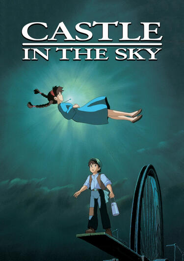
Film 2:Castle in the Sky
directed by Hayao Miyazaki
produced in 1986


Synopsis

Castle in the sky is about a young orphan named Sheeta and her kidnapper, Col. Muska, who are flying to a military prison when their plane is attacked by a gang of air pirates led by the matronly Dola. Escaping from a mid-air collision via a magic crystal around her neck, Sheeta meets fellow orphan Pazu and the pair join forces to discover the mystical floating city of Laputa while pursued by both Muska and the pirates, who lust for the city's myriad treasures.


Scene 1: 1.28.30

When drawing characters as the main element of the scene Miyazaki uses very solid colours along with shadow blocking on the characters. Shadow blocking is often seen in most Ghibli films as they chose to draw their shadows in blocked form, which shows a distinct difference between the main colour and the colour of the shadow. Since Miyazaki favours a more 2D animation art style, shadow blocking helps to show the 2 dimension factor but at the same time help in emphasising the depth of certain areas in the characters. In this scene, you can see how distinct and obvious which parts are the shadows and which are not simply only using two different tones of one type of colour.Other than the use of lines on a character’s facial expression, a simple black outline is also often seen on characters and creatures to help in emphasising that they are the main objects in the scene even if they are positioned far away. It also helps in bringing these characters and creatures out from the background.

Scene 2: 0.12.02

In this scene, there is a clear use of shadow blocking on the birds flying in front of the character and not the character himself. When drawing this scene from Miyazaki’s point of view, the character could be positioned in a way where it is far away from the audience thus not having the need to include shadows or it could be affected by the time of day the scene is in. Even though he doesn’t use shadow blocking for the character he still uses a black outline to emphasise the character and his existence in the scene just like the birds that are flying by.Shadow blocking is not often used on the background objects like the brick wall in this scene and is most often painted with a larger scale of colours and tones, rather than two, to create depth and a more realistic look. Even though the brick wall is just part of the background Miyazaki still made sure that he studies and paints it as realistically as possible, not missing out on any detail.

Scene 3: 1.27.11

Hayao Miyazaki never forgets the details even when they are not an important element in the scene. For instance this scene the main element would probably be the character, Pazu, as he occupies at least ¾ of the whole scene. Once again there is a clear use of lines and shadow blocking in the characters. However, what’s so interesting is the flowers in the front even tho they are not the main element of the scene they are painted with so much detail, which makes them so realistic. Using a large range of different tones and colours on such background elements is a way of letting them stand out by themselves in a subtle way instead of having to draw an outline on them like the main characters or creatures in the scene.

My initial analysis I did but got rejected by me as I felt the analysis was not addressing the information I need to help me in my paintings.

Unlike the previous 2 films which were directed by Hayao Miyazaki, Whisper of the Heart was the only Studio Ghibli film directed by Yoshifumi Kondo before his untimely death in 1998, at the age of 47. The film was an adaptation of a story by famed Manga artist Aoi Hiragi, with a screenplay written by Ghibli’s legendary co-founder Hayao Miyazaki.


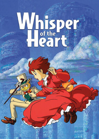
Film 3:Whisper of the Heart
directed by Yoshifumu Kondo
produced in 1995


Synopsis

Whisper of the heart is about Shizuku, an inquisitive young girl and a voracious reader, who longs to be a writer when she grows up. One day she notices that all of her library books have previously been taken out by one Seiji Amasawa. Amid chasing after a large cat, befriending an eccentric antique dealer and writing her first novel, Shizuku aims to find this mysterious boy who may well be her soul mate.


Scene 1: 0.24.59

Kondo’s art style is fairly similar to Miyazaki's.In terms of the way the characters are designed and the way things are drawn and painted, it could have been due to the number of films Kondo has worked on with Miyazaki, which caused him to slowly adapt his style, also Kondo has been working at Studio Ghibli for 8 years prior to this film. Kondo also seems to follow a more traditional 2D hand-drawn style which is very popular in Japanese animation back then. Similar to Miyazaki, Kondo also uses block shadows on the characters as shown in this scene, using only two different tones to make the character more 3 dimensional. Kondo also never misses any detail, the bouquet of flowers on the left and the plates on the shelf on the furthest part of this scene is painted so detailedly with lots of colours and tones, which makes it look realistic.What is cool about this scene is the way the man in the background is drawn and painted. The man in the background is somewhat far away from the audience, and in a dark area of the scene but in a way, he ‘glows’ and stands out from the background because of the simplicity of the lines he is drawn in and the colours that were chosen to use on him.

Scene 2: 1.42.49

When it comes to drawing characters and character designing Kondo also uses very simple lines to give characters different expressions for example in this scene the use of lines on Shizuku’s cheeks shows that she is blushing. Shadow blocking in this scene is also more obvious. Similar to Miyazaki I believe that the use of shadow blocking and outline in Kondo’s characters helps to bring them out from the background and emphasise that they are the main elements in the scene. Something I noticed as well is that Kondo likes using colours on his characters that will make them stand out from the background.

Scene 3:1.1.54

In Kondo’s work, it is very obvious he pays a lot of attention to the emotions and personality of every single character, not just in producing the film but also in the drawing of every single scene. In this scene, you can see that both the characters are positioned so far away from the audience, however, if you are to look extremely closely you can see that both characters especially Shizuku has a clear expression on her face. You can clearly see that she is shocked and wowed at the fact that she is flying and all these feelings are just created by simply drawing three lines. The consistent use of having an outline for main elements throughout scenes in the film also helped to bring out the two characters in this scene.

Scene 4: 0.02.45 (extra scene)

Something unique that I really like in this film is the way, Yoshifumu Kondo created the set of Shizuku’s house. It is so different from the house you would normally see in animated films where the house is always neat, tidy and very simple looking. The way Kondo designs the set makes the place feel so realistic as the atmosphere it gives of signs that human beings actually inhabit them. I especially love how the books are stacked up all around the notes being pasted on the fridge and walls, the level of organization which might make it look messy and disorganised makes this scene feel so real as it gives an indirect characterization of the family.

Comparing the three films:

After watching and studying different scenes in the three different films My Neighbour Totoro, Castle in the Sky and Whisper of the Heart, I would say they are greatly similar in terms of the art style mainly because two of them were directed by Hayao Miyazaki. Even so, Whisper of the Heart which was directed by Yoshifumu Kondo was quite similar as well, in terms of character design and use of tones and colour, for example, constant use of shadow blocking and the simplicity of lines used in drawing. Something I love about both of their work is the fact that they would never forget to leave out any single detail behind in a scene no matter if it is significant or not.One main difference I caught on between the works of Hayao Miyazaki and Yoshifumu Kondo is the way they create their sets. It is really evident from Hayao Miyazaki's works that he really loves to set his films around environmental nature like habitats, not just for the two films My Neighbour Totoro and Castle in the Sky ut for other films as well. Although Whisper of the Heart is the only film Yoshifumu Kondo directed in Ghibli before he passed on, from his past works you can see that Kondo prefers sets that are more realistic to humans, sets where humans inhabit.

To showcase how I have understood my findings from my analysis of the three different films, I decided to try creating scenes that are similar to Ghibli's art style. I choose to work with the painting medium acrylic and hand-painted 3 paintings to showcase my works.

Painting 1:

For my first painting, I wanted to start simple by referring to a picture and trying to add elements that are being used in the three Ghibli films. Starting with a photograph that I can refer to allows me to experiment and understand more about how things are being drawn on paper.


Painting

Reference photo

In this painting, I tried to make use of the way Miyazaki and kondo's way of shadow-blocking in the character, trying to make the character stand out from the background


Sketches and progress photos

Reflection:
I did not really like the way this painting turned out. I felt that I could have experimented with more different elements instead of one and the outcome of the painting was not what I really wanted as well.

Painting 2:

For the second painting, I still wanted to keep it simple and practice more on the basic elements of the ghibli art style. However this time I chose not to reference from an original image and instead draw from my own imagination. Keeping in mind to add other creatures and not just humans in this scene.


Final painting

In this painting, I wanted to set the scene in a nature environment like what Miyazaki likes to do, thus the pond setting with lily pads and koi fishes. I wanted to practice more on using shadow blocking and outline on the character to help bring the character out from the background. I also emphasised the difference between the character and the background by detailing the background so that the character can pop out from it.


Sketches and progress photos

Reflection:The painting did sort of come out the way I wanted it to. I felt like I mange to successfully achieve the contrast in the background and the character. There are room for improvement but as of now, I think overall it I still okay.

Painting 3:

For the third painting, I wanted to also create something from my own imagination, with reference to multiple objects I wanted to include in the scene. After testing out and painting the previous two scenes I feel more confident and comfortable working with the various elements in Miyazaki and kondo’s art styles. So for the final painting, I decided to include all of the different elements and even tricks used by both Miyazaki and kondo in my painting.


Final painting

In this painting, I wanted to go for an abandoned forest look, meaning the scene would look all dark and gloomy. The main reason for having this scene set in a forest is because I wanted to revolve my scene around nature just like how Miyazaki enjoys bringing nature into all his works. Also, I chose to follow Miyazaki technique when it came to drawing and painting the trees by looking at real like trees when drawing and painting hoping that it will make the trees look more realistic.

Other than that I wanted to try learning and exploring the way Kondo gives his scene character, for instance, I tried adding elements like broken flower pots and cobwebs to emphasise the place's abandonment.

One more thing is that I tried drawing with children in mind, Miyazaki once said that children always notice the noticeable. So in my scene, actually added a ball that hiding in the bush right above it there’s a broken window. This hopes to suggest that the window could have been brown by someone throwing the ball against the window.

I of course also used the more basic elements that I used in my previous two paintings like shadow blocking in the character and adding outlines, which I felt like I could have done better, as well as adding facial expressions on a character face to give more emotions to the scene and lastly detailing even the unimportant elements like the background.


Sketches and progress photos

Reflection:I am happy about how the painting mange to turn out especially the trees as I felt it really matches the style of studio ghibli. However, I also feel like there are a few certain areas I can improve on like the character, to make the painting more interesting.


Reference photos

this is an actual picture i took to reference my tree drawings and paintings with


Failed paintings

One of the challenges for me during the painting process was also trying to get my work to look like Studio Ghibli's art style. Especially when it came to painting the trees I could not achieve the way Ghibli paints their trees. So I decided to actually sit down and analyze different three scenes in Studio Ghibli movies.

How my trees initially looked like before I did studied more on the tree

Analysis i did on trees from different ghibli films

Let's reflect

1. Guided Learning process

main challenges

  • struggled in not knowing what I needed in my analysis

  • initial analysis was so simple to the point that it probably would not be of any help when I move on to work on my paintings

  • I had to think through what information I needed and what information was going to help me in my paintings

  • I chose to sit myself down and think through what was my main intention in doing this analysis in the first place, then slowly point out what were the key information I needed to dig out from the films that were going to help me

  • I am glad that I decided to rethink what I was doing and relook at the whole situation as it benefited my process a lot, if I did not choose to rethink I felt the result of my project would not be as successful

  • another struggle I had was trying to complete my paintings on time

  • when filling in my learning contract I did say I overestimated my painting speed, which then led me to choose 3 paintings to paint

  • Starting on the painting I then realise I was an extremely slow painter and I was way behind time, at some point of time I regretted the fact that I had made myself paint 3 paintings

  • Throughout the way, some of the paintings did not turn out the way I wanted them to as I was still unfamiliar with the art style. Thus I decided it would be a good idea if I make my 3 paintings a process so I can finish them in a faster time and I can have more practice before reaching the final painting.

  • The process allows me to try and feel more and more comfortable with the paintings as go along

  • I also chose to cut down the size of 2 of the canvases so it will take me a short amount of time to complete them


2. My personal development ( with relation to TP attributes)

Self-directed

  • prior to guided learning, I was someone who would rather be directed and follow others rather than direct myself to do something.

  • Through guided learning, I understand the importance of being self-directed and how it can improve me as a person.

  • Being self-directed allows me to be more independent and responsible as I set goals for myself to achieve.

  • I have to take responsibility for my own actions and goals

  • Planning something myself forces me to be more independent as only I know what I want to achieve.

Problem-solving

  • Problems I faced during guided learning make me a better solver as I know how to better tackle similar problems in the future be it in other school work or in life.

  • For example, when I faced problems during the analysis part of the project I can better overcome such a challenge in my school work next time if I were to be doing research.

Competent

  • Through problem-solving, I acquire various new knowledge

  • Learning new things allows me to be more responsible,independent and confident


3. New skills and knowledge acquired

  • Acquired new knowledge about Miyazaki's art style and Kondo's art styles as well as the way they work

  • Some new skills I learned are better time management and time planning skills - I better learn to plan my time out, setting goals at the end of every day to get the work done more efficiently

  • better at doing research as during my project I stepped out of my comfort zone and instead of only researching on the web I chose to also use other sources like books and videos to help me with my research

  • Also I better know how to analysis and know what I want when doing my research.


4. Application of new skills and knowledge

  • Time management, independence, and research skills are all skills I can apply to my school life now and in the future.

  • For time management, I can better plan out my daily tasks be it school work or house chores, getting the work done more efficiently, using my time more wisely

  • being more independent means I can be more confident in the work I do and also in who I am.

  • Research skills can also help me to do better in my school work as I know how to properly acquire the useful information that I need.

  • If I were to become an illustrator I would definitely learn and apply Miyazaki's way of working like trying to observe and understand thoroughly what he is going to draw, paint and animate or Knondo who likes giving his scenes a character and a story behind them.

Contains a list of references (links and book titles) that I have used in my project


Articles

What makes Studio Ghibli so magically immersive? - https://www.dazeddigital.com/artsandculture/article/33864/1/what-makes-studio-ghibli-so-magically-immersive

Hayao Miyazaki's movies: why are they so special? -https://www.scmp.com/lifestyle/entertainment/article/3104354/hayao-miyazaki-beginners-who-studio-ghibli-founder-and

My Neighbour Totoro: a visual appreciation -
https://nerdist.com/article/my-neighbor-totoro-anniversary-visual-appreciation-hayao-miyazaki-ghibli/

My Neighbour Totoro -
https://www.rogerebert.com/reviews/great-movie-my-neighbor-totoro-1993

Art of My Neighbour Totoro -
https://characterdesignreferences.com/art-of-animation-7/art-of-my-neighbor-totoro

Art of Castle in the Sky -
https://characterdesignreferences.com/art-of-animation-9/art-of-castle-in-the-sky

Art of Whisper of the Heart -
https://characterdesignreferences.com/art-of-animation-8/art-of-whisper-of-the-heart

Whisper of the Heart Retrospective: The Real Story Behind the Lo-Fi Hip Hop Study Girl -
https://www.animenewsnetwork.com/feature/2021-09-12/whisper-of-the-heart-retrospective-the-real-story-behind-the-lo-fi-hip-hop-study-girl/.175578

Studio Ghibli’s Castle In The Sky at 30 -
https://www.denofgeek.com/movies/studio-ghibli-s-castle-in-the-sky-at-30/

“Almost too beautiful to be true”: Inside Hayao Miyazaki’s genius -
\https://www.itsnicethat.com/features/hayao-miyazaki-jessica-niebel-animation-240122

Illustrator Study: Hayao Miyazaki -
https://wherecreativityworks.com/illustrator-study-hayao-miyazaki/


Book titles

The art of Howl's Moving Castle

The art of My Neighbour Tototro

The anime art of Hayao Miyazaki


Video links

Hayao Miyazaki | The Mind of a Master -
https://www.youtube.com/watch?v=1zi7jIZkS68

The Immersive Realism of Studio Ghibli -
https://www.youtube.com/watch?v=v6Q6y4-qKac